
You can feel a premium interface before you can explain it. The spacing feels intentional. The type feels considered. Nothing looks accidental. But if you ask most designers what makes the difference, they struggle to put it into words.
I have built interfaces at the premium end of the market for years at Elysium Designs. The gap between a good UI and a premium one is not the components. It is the decisions made at every layer, most of which are invisible when done right.
Spacing: The Rhythm Nobody Notices
Think of spacing like music. In a great song, the silence between notes is as deliberate as the notes themselves. In a premium UI, the whitespace is not empty. It is intentional punctuation.
Generic UIs are built by feel. A designer eyeballs the padding here, nudges a margin there. The result is inconsistent. Some elements feel cramped, others feel abandoned. Users cannot name the problem but they feel the discomfort.
Premium UIs use a spacing scale. Eight points. Sixteen points. Twenty-four. Thirty-two. Everything on the screen lives on this grid and nothing deviates. The rhythm it creates is subliminal, but users feel settled inside it.
The fix is boring and non-negotiable: define a spacing scale before you design a single component. Then apply it without exception.
Typography: Hierarchy Is the Whole Game
Most generic UIs have a type problem that nobody admits out loud. Open the inspector and you will find six different font sizes, three different font weights, and no logic connecting any of them. Each screen was designed in isolation.
Premium typography is constraint. Pick two sizes for body copy: one for primary content, one for secondary. Add one size for headings, one for labels. That is four. You rarely need more.
The real work is in the hierarchy, not the fonts. A premium UI tells you exactly what to read first, second, and third without any labels pointing the way. The type weight, size, and color contrast do the directing.
A useful test: blur your screen until everything is unreadable. You should still be able to see the hierarchy as shapes of different visual weight. If everything blurs into the same gray fog, the hierarchy is missing.
Color: Tension Over Decoration
Generic UIs are often proud of their color palettes. Five brand colors, each used liberally, each competing for attention. The result feels like a children's toy. Everything is loud. Nothing stands out.
Premium color is restraint with one moment of intention. You build a near-neutral base, a very tight range of grays or off-whites or deep navies, and then you introduce one accent color. That accent carries all the tension. It marks what matters. It draws the eye exactly where you want it.
The accent color should feel almost surprising when it appears. Like a single red thread in a white shirt. You notice it immediately because everything around it earned the contrast.
The honest diagnostic: if you remove your accent color and the UI still looks roughly the same, you did not use it with enough discipline.
Interaction: UIs That Feel Alive
A dead UI is one that does not respond. You hover over a button, nothing happens. You click, the result appears with no transition, no acknowledgment.
Premium interaction design is micro-feedback at every touch point. Hover states that shift just enough to confirm your cursor is in the right place. Button presses that respond like a physical click. Transitions that ease in and out at 200-300ms, fast enough not to slow you down, slow enough to feel intentional.
None of these are dramatic. A skeleton loader instead of a blank flash. A subtle scale on card hover. A color shift on a form field focus. Small things, each one saying to the user: I see you, I'm responding, you are in control.
Think of a good hotel. You do not notice the staff when service is flawless. You only notice when a glass sits empty too long. Interaction design works the same way. When it's good, it disappears. When it's missing, the whole experience collapses.
The Invisible Layer
Here is the thing nobody tells you early enough in your career. Most of what makes a UI feel premium is invisible when it is done right.
Users do not say, "I love how this uses an eight-point spacing scale." They say, "This just feels really clean." They do not say, "The type hierarchy is excellent." They say, "This is so easy to use." The craft you put in translates into feelings the user cannot articulate.
This is also why premium work is hard to defend in a review meeting. You cannot point at the spacing scale and say, "That's the premium part." The premium part is the sum of a hundred small decisions, each one made with care, each one nearly invisible in isolation.
Generic work is fast because it skips the invisible decisions. Premium work is slow because it makes every single one of them.
Putting It Into Practice
Start with the decisions that compound. Before you design a single screen, lock down your spacing scale, your type ramp, your color system. These are the foundations. Everything else builds on them.
Then audit what you have. Open your current designs, open the inspector, and count your font sizes. Count your spacing values. Count your colors. If the numbers surprise you, you have found your work.
Interaction is last because it is layered on top of a solid visual foundation. Micro-feedback on a messy layout does not save the layout. Get the structure right first, then breathe life into it.
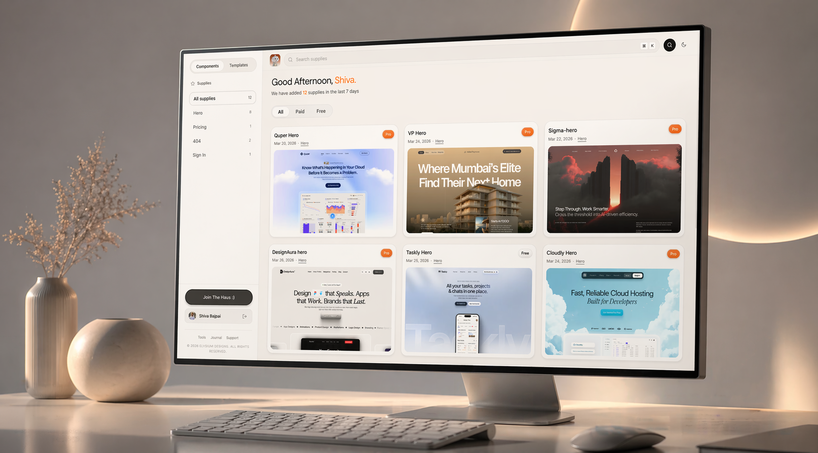
If you want to see these principles applied in actual components and templates, everything at drophaus.in is built with this thinking. Spacing scales locked. Type hierarchies intentional. Color systems that use restraint, not decoration. Browse the components and pay attention to what you feel, not just what you see. That feeling is the work.
Frequently Asked Questions
Does premium UI design require a large budget or senior team?
No. The principles that separate premium from generic are discipline, not resources. A spacing scale costs nothing. A clear type hierarchy costs nothing. The investment is in the decision-making process, not the tools or team size. Solo designers ship premium work every day because they made these decisions upfront and stuck to them.
How many colors should a premium UI use?
There is no single correct number, but a useful starting point is one neutral base palette, one accent color, and semantic colors for states like error, success, and warning. That is a complete system. Most generic UIs have more colors because decisions were never formalised. More is not better.
Can you add premium feel to an existing UI without a full redesign?
Yes, and the highest-leverage fix is almost always spacing. Run a spacing audit, collapse all your unique values into a consistent scale, and reapply it. The visual improvement is immediate and significant. Typography cleanup is second. These two changes alone shift the perception of quality more than any visual refresh.
What is the biggest mistake designers make when trying to create a premium feel?
They chase aesthetics instead of decisions. They add a gradient. They swap in a different font. They add a subtle texture. None of it works because the underlying system is still broken. Premium is not a visual style you apply on top. It is the result of making correct decisions at the foundation level: spacing, type, color, interaction. Get those right and the premium feel follows naturally.